


Step-by-Step Guide to Building a Conversion-Optimized Landing Page That Actually Sells
Synopsis
In today’s hyper-competitive startup ecosystem, driving traffic is no longer the hard part — converting it is. This guide breaks down the real-world process of building a high-converting landing page, starting from early-stage wireframes to advanced A/B testing strategies. Designed for founders, marketers, and growth teams, it blends user psychology, conversion rate optimization (CRO), and practical design frameworks to help startups turn attention into action. The piece also highlights best practices for SEO, AEO (Answer Engine Optimization), and AI-driven content optimization, making it relevant for both search engines and human readers.
Where Most Landing Pages Go Wrong (Let’s Start Here)
You might be wondering, “Why does my landing page look good but barely converts?”
And yeah, that’s a fair question.
In fact, it usually comes down to this: you built a page for your brand, not for your visitor.
Your visitor doesn’t care about your mission statement. Or your five awards. Or that fancy tagline your team debated for two weeks. They care about one thing:
“What’s in this for me, and how fast can I get it?”
Keep that thought. We’re going to come back to it again and again.
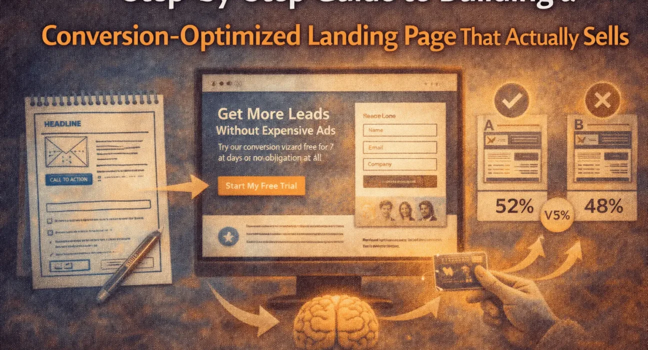
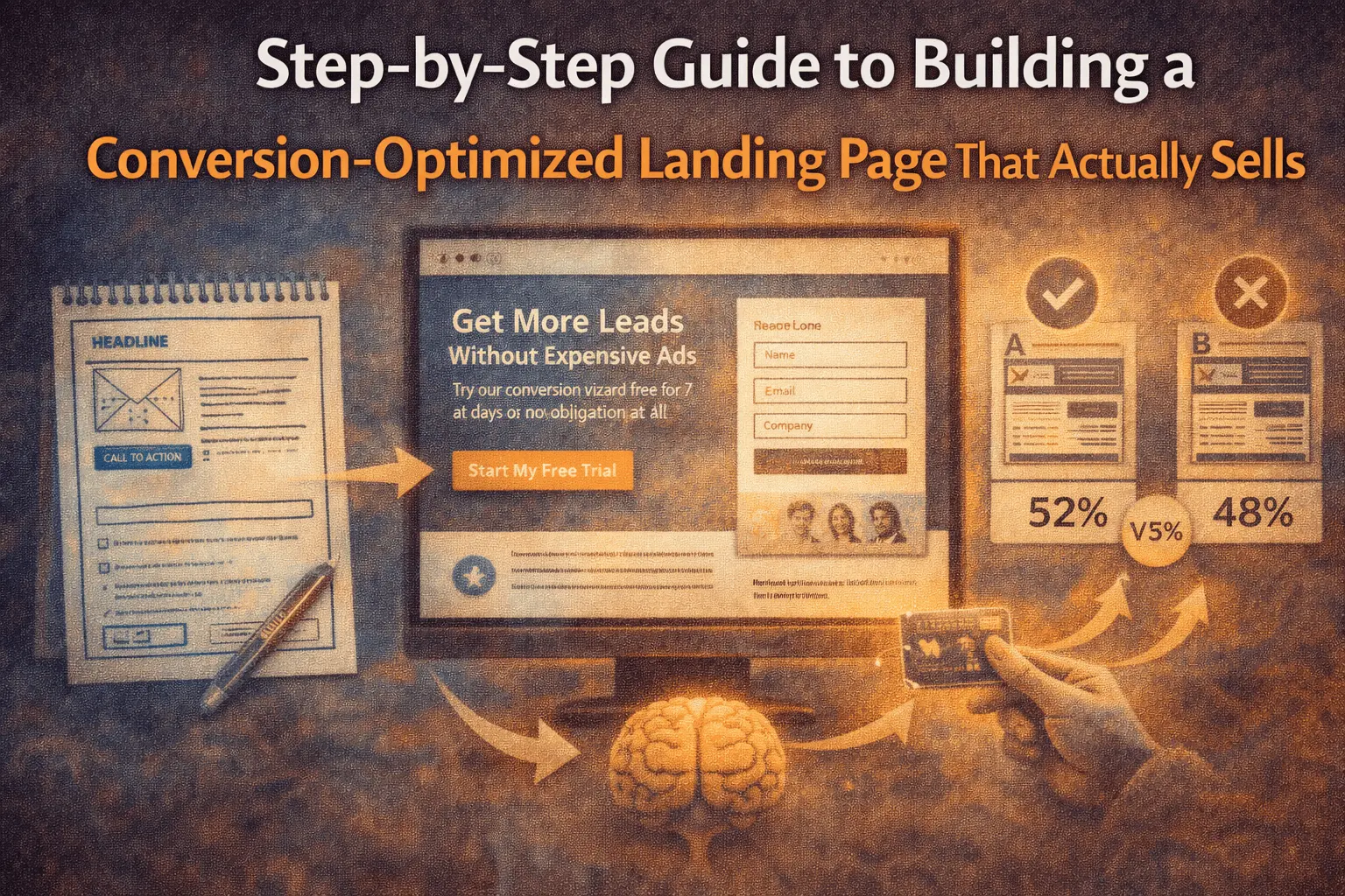
Step 1: Start With a Wireframe (Don’t Skip This, Seriously)
This is the unsexy part. No colors. No fonts. Just boxes and arrows. But honestly, this is where the money is made.
A wireframe forces you to think in flow, not design.
Here’s a simple high-conversion structure you can sketch in 10 minutes:
- Hero Section
- Headline (big promise)
- Subheadline (clear explanation)
- Primary CTA button
- Problem Section
- What’s broken in their world right now?
- Solution Section
- How your product/service fixes it
- Social Proof
- Testimonials, logos, case studies
- Details & Benefits
- What they get, how it works, why it’s better
- Final CTA
- Same action, zero confusion
And yeah, you can use tools like
Figma
or
Balsamiq
to do this fast without overthinking it.
Think of your wireframe like a road trip map. If the route is confusing, no amount of fancy car design will get people to the destination.
Step 2: The Headline Isn’t a Headline. It’s a Deal.
Let’s be blunt.
Your headline is not a “welcome message.” It’s a value contract.
A simple formula that works more often than people want to admit:
Get [Result] Without [Pain Point]
Example:
“Generate Qualified Leads Without Burning Money on Ads”
Clean. Clear. Human.
And your subheadline? That’s where you explain the “how” in one calm, reassuring sentence.
You might want to sprinkle in a keyword here for SEO, like:
conversion optimized landing page for startups
But don’t force it. If it sounds weird when you say it out loud, it’s probably weird on the page too.
Step 3: Understand CTA Psychology (This Is Where Most People Fumble)
Let’s talk about that button.
Because “Submit” is a crime.
“Click Here” is lazy.
And “Buy Now” is sometimes way too aggressive.
A CTA works best when it finishes the visitor’s sentence in their head.
They’re not thinking:
“I want to submit.”
They’re thinking:
“I want to get my free audit.”
“I want to see the demo.”
“I want to start my trial.”
So your button should say exactly that.
Try things like:
- “Get My Free Growth Plan”
- “Book My Demo”
- “Start My 7-Day Trial”
Small shift. Big difference.
Step 4: Build Trust Before You Ask for Anything
This part gets rushed. And it shouldn’t.
People don’t convert because your page is fast. They convert because they feel safe.
Here’s what actually builds trust:
- Real testimonials (with names, photos, or companies)
- Case studies with numbers, not adjectives
- Logos of brands you’ve worked with
- Clear privacy and refund policies
And if you’ve got a strong long-form case study, link it out. Something like:
Read our full customer success story – https://example.com/case-study
That kind of transparency does more than any “Trusted by 10,000+ users” badge ever will.
Step 5: SEO, AEO & AI Optimization (Without Sounding Like a Robot)
Here’s the trick. You’re not just writing for Google anymore. You’re writing for:
- Search engines
- AI assistants
- Featured snippets
- And humans who scan, not read
So structure matters.
Use:
- Clear H2 and H3 headings
- Short paragraphs
- Bullet points where it makes sense
And answer questions directly, like this:
What is a conversion-optimized landing page?
A conversion-optimized landing page is a focused web page designed to guide visitors toward a single action, such as signing up, booking a demo, or making a purchase, using clear messaging, trust signals, and strategic call-to-action placement.
That’s gold for featured snippets and AI search results.
Step 6: A/B Testing (Where Growth Actually Comes From)
Let me say this gently.
If you’re not testing, you’re guessing.
Start simple:
- Test headline vs. headline
- CTA text vs. CTA text
- Long page vs. short page
Use tools like:
- Google Optimize alternative: VWO
- Hotjar (to watch how people actually behave)
Sometimes the smallest change — like turning “Start Free Trial” into “Try It Free for 7 Days” — can lift conversions by 10–20%. And yeah, that adds up fast.
Step 7: Think Like a Startup, Not a Designer
Here’s a mindset shift that helps.
A landing page is not a “project.”
It’s a living system.
You launch it. You watch it. You tweak it. You test it again.
And over time, it becomes this quiet little machine that just… works.
That’s how real growth happens. Not in big flashy redesigns. But in small, smart improvements stacked over weeks and months.
Search Optimization Notes (For Organic Growth)
Primary Search Terms to Target Naturally:
- conversion optimized landing page
- landing page design for startups
- how to improve landing page conversion rate
- CTA psychology for marketing
- A/B testing landing pages
Nielsen Norman Group UX Research
How do you build a high-converting landing page?
To build a high-converting landing page, start with a clear wireframe that focuses on one goal, write a benefit-driven headline, use trust signals like testimonials and case studies, create a CTA that matches user intent, and continuously improve performance through A/B testing and user behavior analysis.
Final Thought (Real Talk)
A great landing page doesn’t feel like a sales pitch.
It feels like a helpful conversation.
Like someone saying, “Hey, I get your problem. I’ve seen it before. And this is what usually works.”
And when you hit that tone — when it feels human, honest, and clear — conversions stop being something you chase.
They start being something you earn.
Summary
Article Name
Conversion-Optimized Landing Page Guide (2025) | Step-by-Step
Descriptionconversion optimized landing page, landing page optimization guide, high converting landing pages, landing page CTA psychology, A/B testing landing pages, SaaS landing page best practices, CRO landing page checklist
Author
Upstartzen Editorial Team
Publisher Name
Upstartzen